
What Is a Landing Page and How Is It Designed?
If you allocate a budget to an advertising campaign and direct the traffic to your homepage, you are probably losing a large share of your potential customers within the very first seconds. A landing page is a dedicated page that focuses the visitor on a single goal and removes distracting menus and unnecessary links. It is designed to guide users coming from Google Ads, Meta ads or email campaigns directly toward filling out a form, making a purchase or requesting a quote.
A well-structured landing page can double your conversion rate with the same advertising budget, while a poorly designed page can waste every penny you spend. In this guide, we cover the concept of landing pages from every angle: what they are, how to design them, the essential elements they should include, common mistakes, real-world examples and how to measure performance.
1. What Is a Landing Page Really and What Does It Do?
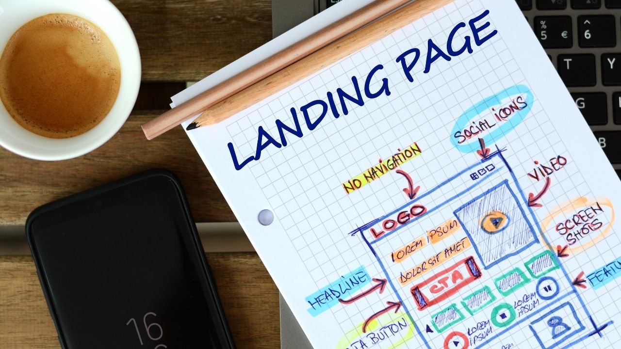
A landing page is an independent web page where a visitor arriving from an advertisement, email link or social media post first lands, and it serves a single conversion goal. While a standard website may contain dozens of menus, links and different content areas, a landing page gives the visitor only one action to take: fill out a form, add a product to the cart, request a demo or download a file. This focus shapes the entire design and copy structure of the page.
In practice, landing pages are generally divided into two main categories. The first is “lead generation” pages, which are designed to collect potential customer information. These pages ask visitors for contact details such as their name, email address or phone number and offer something in return, such as a free guide, discount code or consultation offer. The second is “click-through” pages. Instead of using a direct form, these pages provide persuasive information and guide the visitor to the next step, usually a payment page. E-commerce sites and SaaS products frequently use this type.
The primary function of a landing page is to deliver an experience that perfectly matches the advertising or campaign message. If a user searches Google for “office cleaning prices in Istanbul” and clicks your ad, the page they reach should show exactly the details of your Istanbul office cleaning service, the price range and a quotation form. If they land on your homepage, they may get lost among the menus, fail to find what they are looking for and leave. A landing page is the bridge that eliminates this disconnect.
There is only one criterion for determining whether a landing page is successful: the conversion rate. How many people visited the page, and what percentage of them completed the desired action? Although this rate varies by industry, a well-optimized landing page typically converts between 5% and 15% of visitors. In some niche sectors, the rate can even exceed 20%.
2. What Is the Difference Between a Standard Web Page and a Landing Page?
A website homepage or service page serves multiple purposes. Visitors can read the About Us section, browse blog posts, explore different product categories or find contact information. Under normal circumstances, this versatility is an advantage; however, when it comes to advertising traffic, it becomes a direct disadvantage. Every additional link and menu item increases the likelihood that the visitor will move away from the main goal.
A landing page deliberately limits these options. There is no top navigation, footer links are kept to a minimum, and a single CTA (call-to-action) is repeated throughout the page. Although this structure may seem restrictive at first glance, it is extremely effective from a conversion psychology perspective. According to the principle known as “Hick’s Law,” the fewer choices people are given, the faster and easier it becomes for them to make a decision.
There are also important technical differences. Standard web pages usually use the site-wide template structure (header, sidebar, footer). A landing page, on the other hand, has a self-contained design independent of that template. Page-speed optimization is easier because there are fewer unnecessary scripts and stylesheets to load. Setting up an A/B testing infrastructure is also much more practical because every element on the page is under control.
Another critical difference is message match. The headline and content of a standard page are general and attempt to appeal to visitors with different profiles coming from different sources. A landing page, however, is built to respond directly to a specific keyword within a specific ad group or to a specific campaign message. If your ad says “Your first month is free,” the page headline should reflect the same promise. This consistency improves your Google Ads Quality Score, lowers your cost per click and, most importantly, builds visitor trust.
3. Why Should We Always Use a Landing Page in Advertising Campaigns?
Digital advertising spending increases every year, yet many businesses still fail to use their budgets efficiently. One of the biggest reasons is directing ad traffic to pages that are not designed for the campaign’s purpose. If you are paying TRY 5–10 per click in a Google Ads campaign and 95% of those visitors leave without converting, you are losing a substantial amount of budget. A landing page exists to minimize this loss.
Google Ads’ Quality Score system evaluates how closely related your ad is to the page you send users to. When you direct traffic to a generic homepage, the alignment between the keyword in the ad and the page content remains weak. This results in a lower Quality Score, higher click costs and fewer impressions. A purpose-built landing page reverses this cycle: stronger relevance, higher Quality Score, lower cost and more impressions.
The situation is no different with Meta (Facebook and Instagram) ads. A user sees an ad in their feed, becomes interested in a specific product or offer and clicks it. If your general homepage appears, the user has to search for that product or offer again and most likely will not bother. With a landing page, the user sees exactly what was promised the moment they click. This frictionless experience directly affects the conversion rate.
Beyond advertising platforms, landing pages also make a major difference in channels such as email marketing and influencer collaborations. Instead of saying “Discover our new collection” in an email campaign and directing users to the homepage, creating a dedicated landing page for that collection improves the user experience and makes campaign performance easier to measure. You can clearly see how many conversions came from each campaign.
Advertisers that do not use landing pages unknowingly give their competitors an advantage. Imagine two companies competing for the same keyword: one sends traffic to its homepage, while the other directs visitors to a dedicated landing page. Because the second company has a higher conversion rate, it can acquire far more customers with the same budget. Over time, this difference can turn into a significant gap in market share.
4. Step by Step: How to Design a Landing Page That Turns Visitors into Customers
Landing page design is about much more than creating a visually attractive page. Every design decision should move the visitor one step closer to the goal. This process starts long before the page goes live, with a clear definition of the target audience and the campaign objective.
The first step is defining the goal. What do you expect from the page? A form submission, a purchase, an app download? The answer determines the entire structure of the page. Setting multiple different goals on a single page often means achieving none of them. Once the goal is defined, identify the person who is expected to complete it. What problem are you solving? What stage is this person at? Are they hearing about your product for the first time, or are they already comparing alternatives? This information directly affects the language, length and persuasion strategy of the page.
The second step is building the message hierarchy. At the very top of the page, there should be a headline that captures the visitor’s attention within the first 3 seconds. This headline should be consistent with the promise in the ad and clearly answer the question in the visitor’s mind. Directly below it should be a subheading that summarizes the offer in one sentence. The rest of the page should then present trust elements, benefits and supporting evidence. When writing the copy, it is crucial to focus on benefits rather than features. Instead of saying “We have a 24/7 support line,” saying “Call us even at 3 a.m. and we’ll solve your problem” is far more effective.
The third step is visual design. A clean, distraction-free design is always more effective than a complex one. Whitespace should be used generously, CTA buttons should use a color that stands out from the rest of the page, and the visitor’s eye should naturally flow toward those buttons. In the hero section, using an image that shows the product or service in a real-world usage context builds far more trust than stock photography. Video is also a powerful tool for increasing conversion rates, but a click-to-play format should be preferred over autoplay.
The fourth step is form design. Every additional field requested in a form reduces the conversion rate. At the first stage, a name and either an email address or phone number are usually sufficient. In B2B services, fields such as company name and job title can be added, but you should question whether they are truly necessary. The form’s position on the page is also important: it should be visible above the fold and remain easy to access as the visitor scrolls down the page.
The final step is the pre-launch check. Test the page on mobile; approximately 70% of web traffic in Türkiye comes from mobile devices. Check page load time; pages that take longer than 3 seconds to load lose half of their visitors. Test the form submission, make sure the thank-you page works correctly, and verify that conversion tracking codes (Google Analytics, Meta Pixel, etc.) are firing properly.
5. Essential Elements of a High-Converting Page
A successful landing page is created by bringing certain building blocks together in the right order and with the right alignment. If any of these elements is missing or weak, the overall performance of the page is directly affected.
- Attention-grabbing headline consistent with the promise: This is the most important piece of text on the page. After reading the headline, the visitor should feel that they have arrived at the right place and be convinced that the rest of the page is worth reading. A mismatch between the ad copy and the headline is one of the main causes of high bounce rates.
- A clear, single CTA (Call-to-Action Button): A button that is repeated throughout the page but always leads to the same action. Action-oriented phrases such as “Get a Quote Now,” “Try for Free” or “Book an Appointment” should be used. Vague labels such as “Submit” or “OK” reduce conversions.
- Trust signals: Customer reviews, brand logos, certifications, media coverage, case studies or risk-reducing elements such as a “30-day money-back guarantee.” These elements shorten the decision-making process, especially for brands visitors are encountering for the first time.
- Mobile-friendly (responsive) design: Buttons must be large enough to tap comfortably with a finger, form fields must be usable on mobile, and images must scale correctly to the mobile screen. These are fundamental requirements.
- Fast loading time: According to Google research, when mobile load time increases from 1 second to 3 seconds, the bounce rate rises by 32%. Unnecessary scripts, unoptimized images and excessive external requests are among the most common factors that destroy page speed.
- Benefit-focused content blocks: Instead of listing the technical specifications of a product or service, use short, clear content blocks that explain what those features will actually change in the user’s life.
- Visual proof: A photo showing the product in use, a before-and-after comparison showing the result of a service, or a video testimonial featuring a real customer. People trust concrete evidence more than abstract promises.
- Urgency or scarcity element: Fact-based phrases such as “Last 3 days,” “Limited availability” or “Valid this month.” Creating fake urgency may work in the short term, but it damages brand credibility in the long term; therefore, any scarcity statement you use should be genuine.
6. The Most Common Landing Page Mistakes That Cost You Sales
Many businesses create landing pages but fail to achieve the conversions they expect. The problem is usually not the visual design, but mistakes in strategy and execution. Being aware of these mistakes gives you the opportunity to correct them before publishing the page.
The most common mistake is a mismatch between the advertising message and the page content. If the user sees “50% discount” in the ad, the first thing they should see on the landing page is that discount and its conditions. If the page does not mention the discount at all, the visitor may feel misled and leave immediately. This causes both a loss of conversions and a lower Quality Score on advertising platforms.
The second critical mistake is assigning multiple goals to the same page. Pages that include an email-list signup form, a product purchase button and links to blog posts all at once distract the visitor. Every additional option increases the likelihood of moving away from the primary goal. A landing page should do one job and do it extremely well.
The third mistake is designing a page that is either excessively long or excessively short. The right length depends on the complexity of the offer and the visitor’s level of awareness. A long persuasion page is unnecessary for a simple, low-cost product and may bore the visitor. However, two paragraphs are not enough to build sufficient trust for a high-value B2B service. The rule is simple: provide all the information the visitor needs to make a decision, and not one word more.
The fourth mistake is ignoring the mobile experience. A page that looks perfect on desktop can become difficult to use on mobile, with small form fields, untappable buttons and images overflowing the screen. Since the vast majority of internet users in Türkiye access the web from mobile devices, this mistake translates directly into lost revenue.
The fifth mistake is a lack of social proof. Saying “We are the best” convinces no one. However, a statement such as “96% of our 342 customers recommend us,” or a testimonial that includes a real customer’s name and photo, can help visitors overcome the trust barrier. Failing to add social proof to a landing page means giving up one of your strongest persuasion tools.
7. Successful Landing Page Examples You Can Use for Inspiration
To turn theory into practice, it is useful to look at some of the approaches widely referenced in the industry. Every successful landing page uses a different strategy, but several principles are common to all of them.
In the SaaS (software-as-a-service) sector, the most effective landing pages often stand out with a minimalist design. The headline clearly states the problem the software solves, a free-trial button appears immediately below it, and the rest of the page features product screenshots and customer logos. Landing pages from brands such as Slack, Dropbox and Notion are classic examples of this structure. Their common characteristic is that they include no unnecessary elements; every pixel serves a purpose.
Successful e-commerce landing pages generally adopt a product-focused approach. High-quality photos of the product from different angles, pricing information, customer reviews and a “Buy Now” button form the core of the page. Especially on single-product promotional pages, adding a short video that tells the story of the product can noticeably increase conversion rates. Apple’s product launch pages are among the strongest examples of this approach.
In the service sector (consulting, agencies, healthcare, education, etc.), the most effective landing pages are built around trust. A clear value proposition appears at the top of the page, a detailed service description in the middle, and customer testimonials and case studies toward the bottom. Particularly for local services (dental clinics, law firms, cleaning companies, etc.), location information, Google Maps integration and a prominently displayed phone number are elements that increase conversions.
On event and webinar registration pages, time pressure is often used as the strongest persuasive mechanism. Countdown timers, limited-capacity messaging and short speaker introductions are standard elements. On the best-performing pages of this type, the registration form asks only for a name and email address; unnecessary fields are not added. The value of the event is summarized in short bullet points, and an action-oriented CTA such as “Reserve Your Spot” is used.
Across industries, successful examples share the same key characteristics: the page focuses on a single goal, the headline matches the advertising message, the CTA button is prominent and repeated, social proof is present, and the page works flawlessly on mobile.
8. The Design Is Finished: Which Metrics Should We Use to Measure the Page’s Success?
Publishing the landing page is only half the job; the real performance comes from measurement and optimization after launch. Without knowing which metrics to track, it is impossible to understand whether the page is truly working.
Conversion rate is the most fundamental and important metric. It shows the number of people who complete the desired action relative to the total number of page visitors. For example, if 50 out of 1,000 visitors complete the form, your conversion rate is 5%. What counts as a “good” rate varies by industry and offer type, but as a general benchmark, 2–5% is considered average, 5–10% good and more than 10% excellent. What matters most is knowing the average for your own industry and continuously aiming to improve.
Bounce rate shows the percentage of visitors who arrive on the page and leave without interacting. On landing pages, a bounce rate of around 60–70% can be normal because the page has a single purpose: visitors either convert or leave. However, if the rate rises above 80%, you should investigate a possible issue with ad-to-page relevance, loading speed or the above-the-fold design.
Average time on page and scroll depth show how much visitors engage with your content. If only a small percentage of visitors reach the bottom of the page, the upper sections may not be engaging enough or the page may simply be too long. Heatmap tools such as Hotjar and Microsoft Clarity visualize this data and clearly show where you are losing visitors.
Cost per acquisition (CPA) shows the total advertising budget you spend to generate one conversion. It is calculated by dividing total ad spend by the number of conversions. This metric allows you to evaluate landing page performance together with advertising costs. If your CPA is above your target customer acquisition cost, you either need to optimize the page or narrow your advertising targeting.
A/B testing is the most reliable way to improve all of these metrics. By running two different versions of the page at the same time, you can determine, based on data, which headline, CTA copy or form structure performs better. The key is to test only one variable at a time: if you change the headline, image and button simultaneously, you will not know what caused the difference. The test must also run long enough; avoid drawing firm conclusions until you have generated at least 100–200 conversions.




Do Comment